
Imagine you’re viewing a bar chart of Google Ads conversions by month in Google Data Studio.
Want to know how branding campaigns affect performance?
-
Photo by the author, April 2022
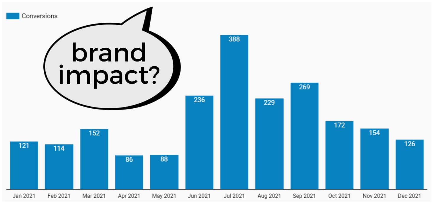
You’ve decided to add campaigns as a ‘detail dimension’ so you can see conversions by campaign.
This division does not give you the result you were hoping for:
-
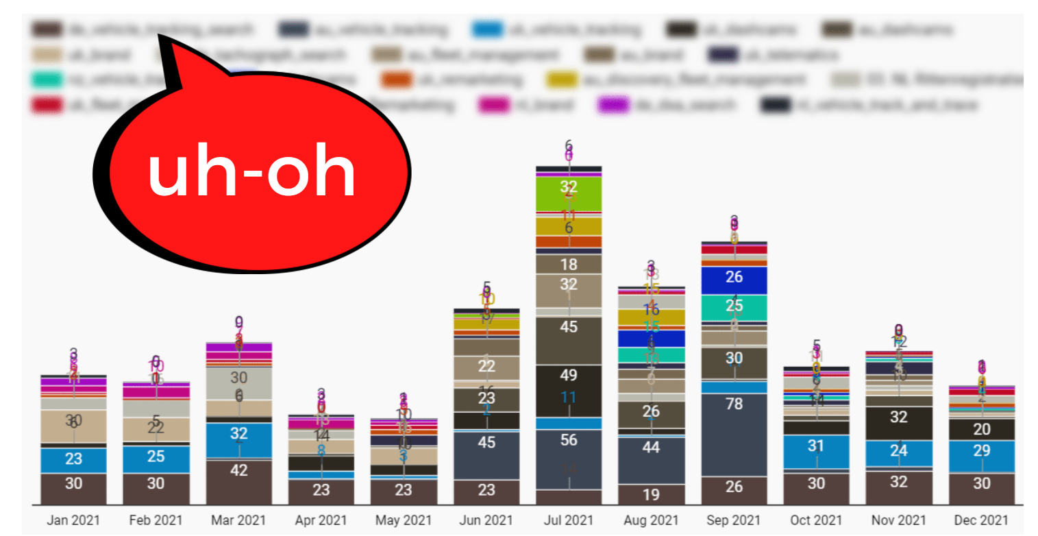 Photo by the author, April 2022
With dozens of campaigns across multiple accounts, this scheme is too noisy to be useful.
So… what now?
You can create a filter for branding campaigns.
However, this will filter out the performance of any non-branding campaign – which you don’t want to do.
If supported, importing your labels from Google Ads should fix the issue.
How do you create your own slices in Data Studio, so that you are in complete control of your visualizations and can get better insights?
Answer: CASE.
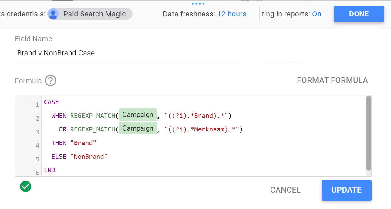
This CASE statement allows you to group branded and non-branded campaigns into two separate sections:
-
 Screenshot taken by the author, April 2022
Using the above code, campaigns that don’t have a ‘brand’ (or in Dutch ‘Merknaam’) will be grouped as ‘NonBrand’.
The end result is exactly what we hoped for: a stacked bar chart with a detailed dimension showing conversion totals for Branded and Non-Brand campaign groups only.
-
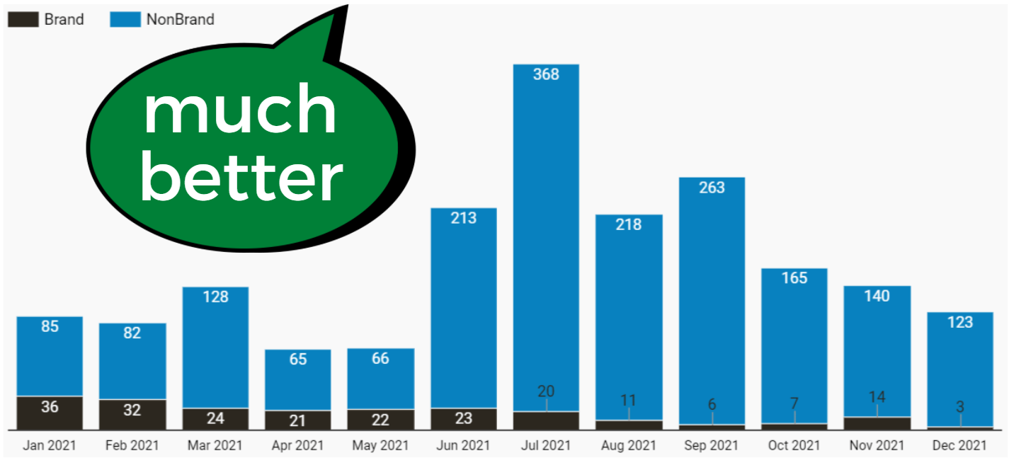 Photo by the author, April 2022
The trend in this graph is clear: Brand conversions have been in a steady decline over the course of the year.
This insight can now drive a strategy to address the problem.
If using CASE to get custom slices in Data Studio has left you frustrated and confused, fear not.
This article will show you how to use CASE with confidence, and also give you some examples that you can apply directly to your reports for better visualizations.
The case for the case
It’s hard to discuss CASE expressions without getting a little technical, so let’s start with it W3 SchoolDefinition of a CASE statement:
The CASE statement passes through the conditions and returns a value when the first condition is met (such as an if-then-else statement). So, once the condition is true, it will stop reading and return the result.
If there are no valid conditions, it returns the value in the ELSE clause. If there is no ELSE part and there are no valid conditions, NULL is returned.
In other words, you can set conditions for your segment (“Brand Campaigns” in the example above).
If the condition is met (the campaign name contains “Brand”), it is included in the Brands group. If the condition is not met (the campaign name does not contain “Brand”), it is in the NonBrand group.
If this illustration seems too simplistic, let’s take a slight look at it A more complex scenario for using CASE From the help pages for Google Data Studio:
A common use of CASE is to create new classes or groups of data. For example, to aggregate the country values specified in the Sales territory dimension, you can create a CASE expression like this:
Issue
When the country is in (“USA”, “Canada”, “Mexico”) and then “North America”
When the country is in (“England”, “France”) then “Europe”
elseEnd
In this example, five different countries on two different continents are combined, with the category “Other” to catch any additional countries.
A list of tens or even hundreds becomes a clean list of three.
The power of data studio case expressions
Simplify, clarify, and focus busy diagrams with custom slides and groups.
-
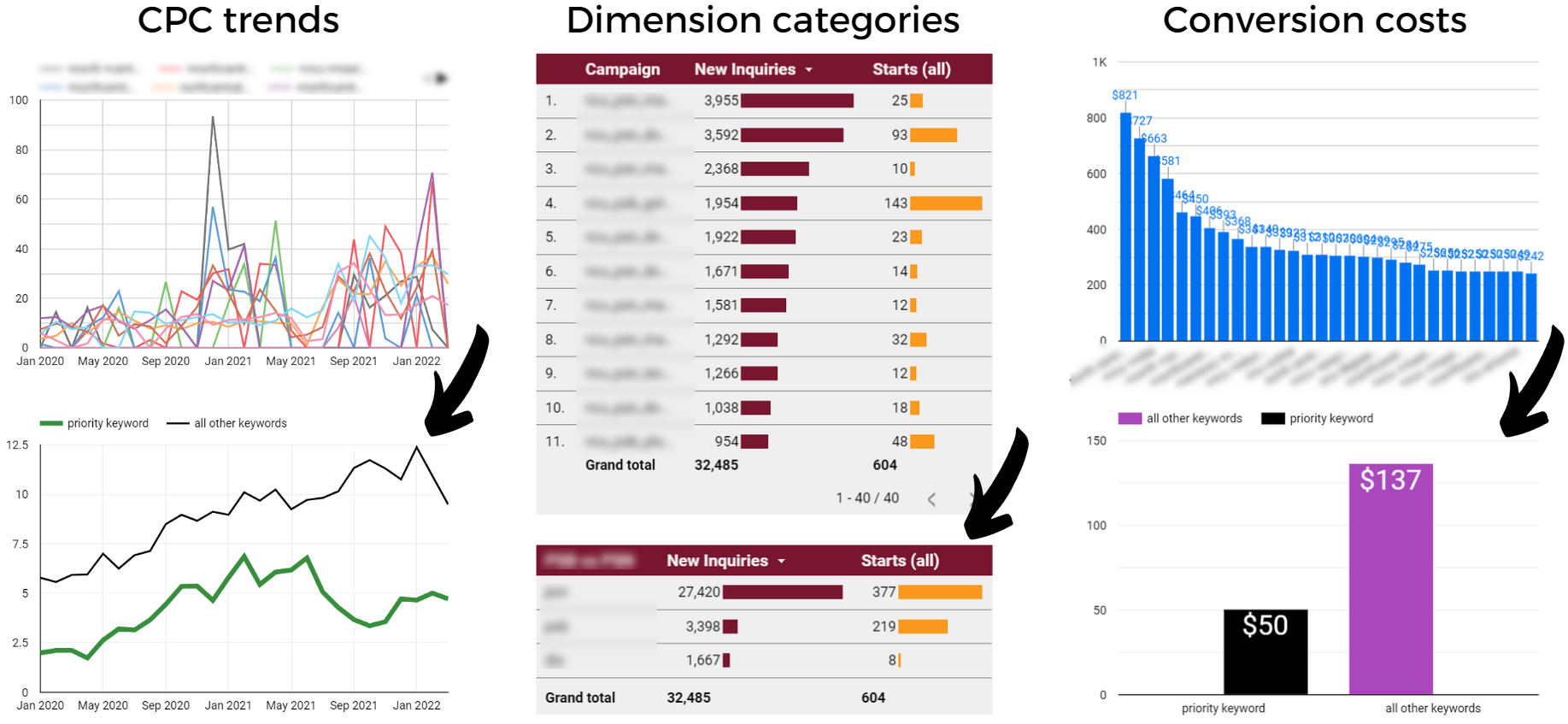 Photo by the author, April 2022
With CASE expressions, you can:
- Rebuilding labels used in your Google Ads account.
- Group your Google Ads campaigns by priority, target region, language or topic.
- Combine or customize default dimensions in the data source (eg switching Google Analytics default channel grouping with custom channel grouping).
- Compare the performance of a single keyword or asset to a group or category.
After learning some basic syntax and syntax, you can create CASE expressions to solve your own segmentation and classification challenges.
How to use CASE Expressions in Data Studio
Looking for step-by-step instructions for using Data Studio CASE expressions? Look no further.
Here we will review how to add a CASE statement and set up the formula.
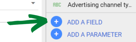
1. Create a calculated field
You’ll find this option at the bottom right of the dashboard. Click the blue “Add Field” button.
-
 Screenshot taken by the author, April 2022
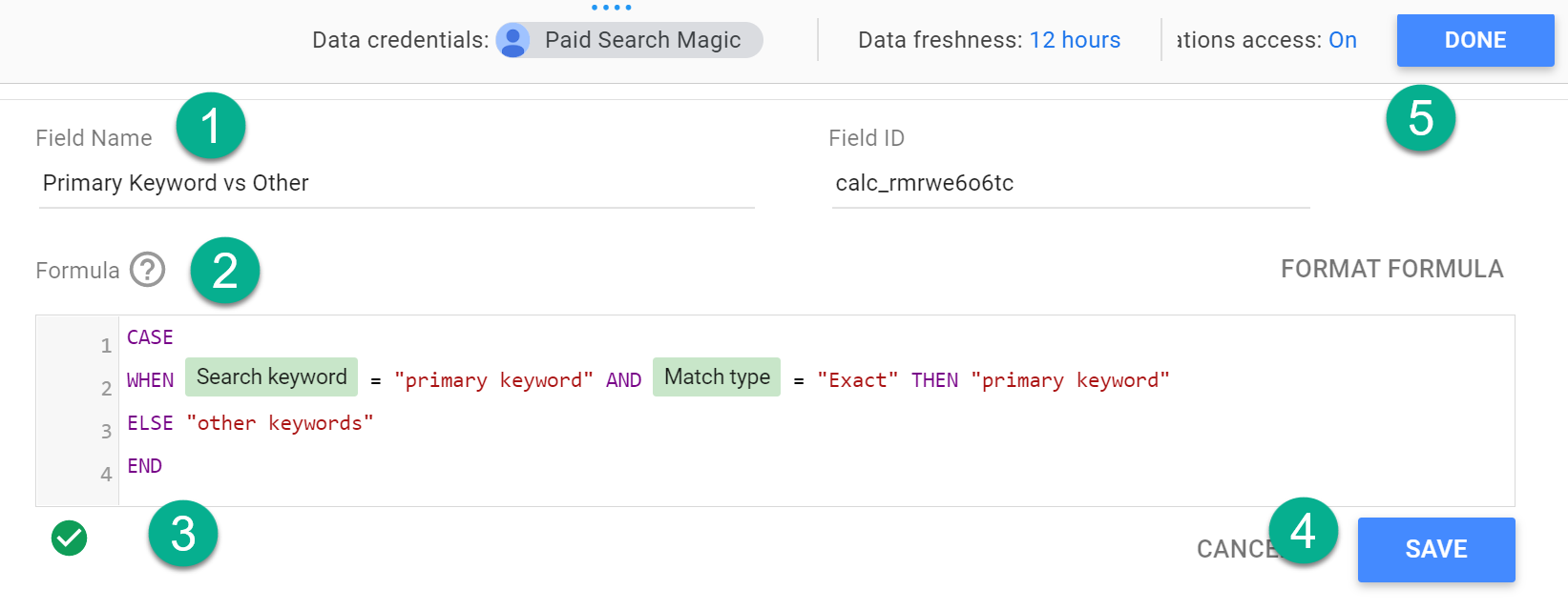
2. Enter and save the case statement
Name your field, then enter your phrase into the formula box (more on that below).
-
 Screenshot taken by the author, April 2022
A valid formula will show a small green arrow below the formula box.
Then press “Save” (or “Update”) and “Done”. Skipping Save will produce the exact result you’re expecting, so don’t forget to hit both buttons.
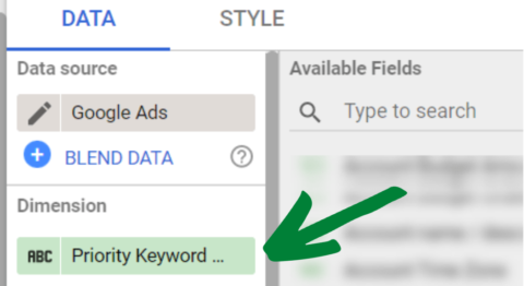
3. Add the field as a dimension in your graph
You will find your new field containing the CASE statement in the list of available fields from the Dashboard, and you can add it as a dimension to your schema.
-
 Screenshot taken by the author, April 2022
You can edit the CASE expression at any time by clicking on it from the Available Fields section of the Data panel.
How to write your own case statement
Now that you know how to add a CASE expression in Data Studio, let’s look at the syntax you’ll use to build your formula.
You will use the following components in the formula box for the CASE statement:
- Issue (Opens the formula).
- when (describes the situation).
- and then (describes the result when the condition is met).
- else (Optional: describes the result when the condition is not met).
- End (Formula closes).
As you’ve already seen in this article, there are many ways to format a CASE statement.
Ultimately, you’ll want to find a “common denominator” that only applies to the condition you specify using “when”.
Here are some examples of how to set up the WHEN/THEN formula:
- when [field] = ‘state’ then ‘result’
- when [field] ! = “status” then “no result”
- when [field] in (“value a”, “value b”, “value c”) and then “result”
- when REGEXP_MATCH ([field]”,”.*condition*”) then “result”
- when CONTAINS_TEXT ([field]’state’), then ‘result’
You can progress a lot more than that, but that should be enough to get you started.
CASE limitations and caveats
With the great power of CASE comes the great responsibility of making sure your data is… actually accurate.
Here are some things to monitor and fix.
Compilation errors and solution
The source of the data and the way metrics are aggregated can lead to inaccurate or broken charts, including:
- Unweighted Average of Average: Calculating the mean distorts actual performance measures.
- Metric aggregation average: Displaying an aggregate average is completely wrong.
- User Configuration Error: Some data sources will throw a configuration error instead of returning incorrect aggregations.
-
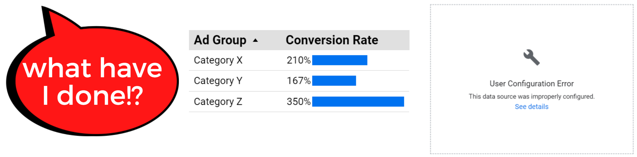 Photo by the author, April 2022
Solution: Do not group pre-calculated fields.
If you have a metric that is a calculation (CPC, AOV) instead of a raw total (cost, sessions), here’s what to do instead:
Create a new calculated field. Enter the formula, and switch the scale in your graph data panel with your new field.
-
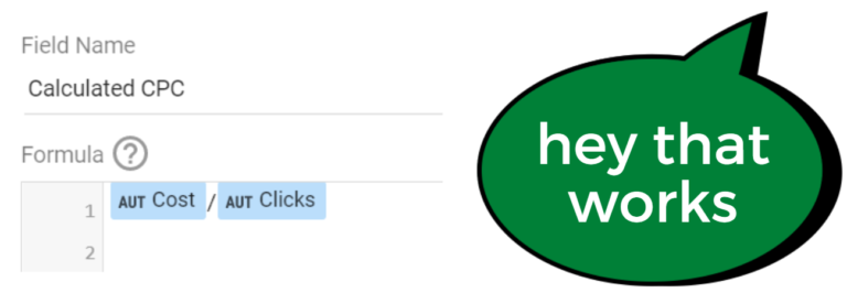 Photo by the author, April 2022
Hash Trap (Signal vs. Noise)
There is no limit to how data can be sliced and diced, but there is a limit to how valuable some pieces of data can be.
Correlation is not causation, and identifying trends is not as valuable as knowing cause.
So while you can segment your data by average CPC ranges, it’s the intent of the keyword, not the CPC, that drives post-click performance.
Make sure your slides correlate with the effect shown in your diagram, or you’ll find yourself optimizing for noise rather than signal.
Other restrictions
CASE has other limitations.
for example:
- CASE operates in sequential order. If a value meets the criteria of multiple classes, it will only be included in the first one listed in the CASE statement.
- You cannot mix dimensions and measures within a WHEN condition.
- You cannot use a formula within a WHEN or THEN clause.
- The CASE field you create is unique to the data source. If you need the same formula for multiple data sources, you will need to create new instances.
You’ll learn more about CASE with it, but knowing the limitations means less time troubleshooting and searching help forums.
conclusion
CASE statements are a powerful way to group and segment your data in Google Data Studio.
It’s not as simple as the drag and drop system you’re used to. But it is also not far-fetched.
Learn basic grammar and syntax, and before you know it, it’ll become the go-to tool in your visualizations toolbox.
More resources:
- More Search Console insights have been added to Google Data Studio
- 11 amazing SEO data visualizations to inspire your reporting
- Advanced Technical SEO: A Complete Guide
Featured image: Billion Images / Shutterstock