
Competitor analysis is often the first place new companies go to research their market and keywords.
However, many new companies struggle to derive significant value from competitor analysis because they often don’t keep track of the right variables or understand how to interpret their data.
Fortunately, visualizing the results of competitive analysis in readable charts, graphs, and maps provides marketers with an easy way to learn more about their competitors and their business.
In this guide, I’ll walk you through the basic steps of creating a competitor map, and give you my favorite tricks to help you learn more in the process.
What is the competitor’s scheme?
Competitor mapping is the competitive market analysis process used to visualize the relationship between two or more variables to help companies discover a competitive advantage.
For example, competitor maps can be used when launching a new product or service to determine the relationship between product price and perceived benefit.
Competitor maps can take several different forms, such as:
- Scatter graphs.
- comparison charts.
- Graphs.
- Line graphs.
- Gantt charts.
- Pie charts.
Now that you have a general understanding of competitor mapping, let’s discuss the benefits of this strategy and how to leverage it to our advantage.
Benefits of competitor mapping
Competitor mapping can help you:
- Identify areas in your business that require improvement.
- Visualize data in a medium that is easy to share and digest.
- Find areas to take advantage of competitor weaknesses.
- Validate your Unique Selling Proposition (USP).
- Determine standards for future growth and development.
- Analyze the relationship between multiple variables to create the best balance for a new product launch (eg price-benefit value).
- Identify unexpected obstacles to launch.
- Learn more about the relationship between customers, competitors, and products.
- Identify areas that competitors do not serve (for example, market or location maps).
- Implement strategies for market growth.
How to build a competitor map
1. Identify your competitors
The first step to conducting a competitive analysis and building a competition map is to identify your competitors.
Ideally, I’d like to keep the number of competitors I’m tracking on a map anywhere between 4-10 companies to keep my data less random.
If you are not familiar with your competitors online, Google a primary keyword and see which businesses appear in the Ads and Membership sections. A “near me” search will also work for local businesses in your area.
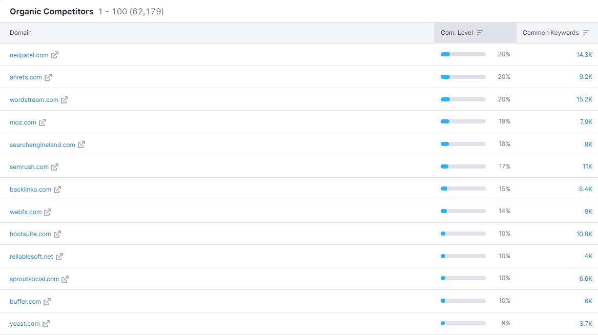
Download keywords shared with your competitors using SEO tools like Semrush, Ahrefs, Sistrix, SE Ranking, or others.
Once you have a list of competitors, do a thorough analysis of their products, pricing, online reviews, or any other variables you find relevant.
2. Identify areas of your business that require deeper analysis
Ask yourself: What areas of my business would I like to track? Am I looking to launch a new product? Next, I’ll need a price-benefit analysis.
Am I looking to move to a new location? Then I would need a sitemap tracking market share.
One way to uncover the different variables for analysis is to perform a SWOT analysis.
| opportunities | threats | |
| strength point | How can I maximize my company’s strengths to gain additional market share? | What is one of the strengths that competitors use to gain market share? |
| vulnerabilities | What is one weakness that my company can take advantage of? | What is one weakness that could cost my company market share? |
From there, you can discover different variables, such as location, price, or reputation that can be drawn.
Again, separate the variables between what you can and cannot control before submitting to a more rigorous competitive analysis.
3. Choose your variables to track
The variables you track will depend on the field of work you seek to learn more about.
So to help simplify your analysis, I’ve listed a bunch of variables based on specific areas of your business that you might be analyzing.
- Launch a new service: price/interest, subscriptions/share.
- New menu item: calories / taste.
- market share: brand perception / quality, brand perception / price.
- Marketing campaign: traffic / share keywords.
- New location: location / options.
There are almost an infinite number of variants to choose from and compare.
It is understanding the value between those variables that is essential.
For example, a tech startup might conduct a price-benefit analysis to determine how much value people think they get from your products at the current price.
On the other hand, a luxury brand may benefit most from a price-value comparison to determine how the price of its products affects its brand perception.
What you will find is that variables such as price have different effects, which need to be balanced for your audience.
So, in some cases, raising the price may make your brand look more sophisticated, while in other cases, it may make your products feel less valuable for the hefty price that customers have to pay.
This is why I recommend running several different forms of competitive analysis based on different variables.
4. Visualize your data
Next, you need to learn how to visualize your data. There are several tools I’ll show you below, from simple design tools to advanced data visualization tools.
Create a scatter graph in Excel
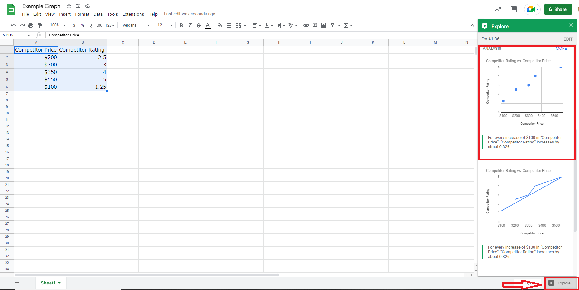
The easiest way to get started is to create a simple scatter plot that tracks two variables using Google Sheets.
For example, in Google Sheets, label column A variable X or control variable in Google Sheets and column B label variable Y or dependent variable.
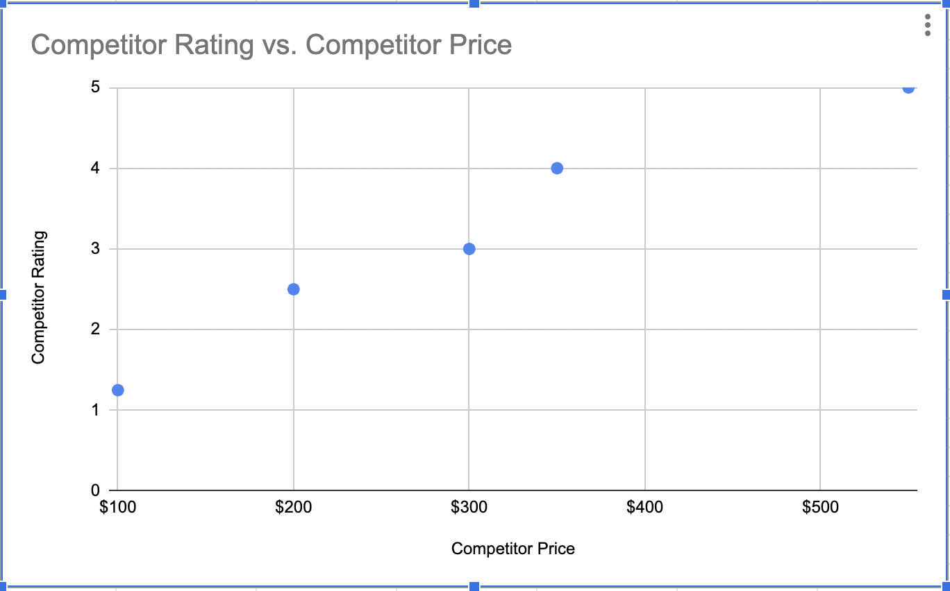
In this example, I’ve plotted the relationship between the price of a one-time service and the company’s valuation on Google.
Highlight your data range and click the Explore button at the bottom right. Google will give you multiple options for charts, including a simple scatter chart.
 Screenshot from Excel, November 2022
Once you fill in all of your values, Google will automatically generate a chart for you that you can share or download.
 Screenshot from Excel, November 2022
In this example, I saw that every time competitors raised their price by $100, they received a 0.862 rise in their rankings, which shows me that higher prices may affect brand perception or be associated with product quality.
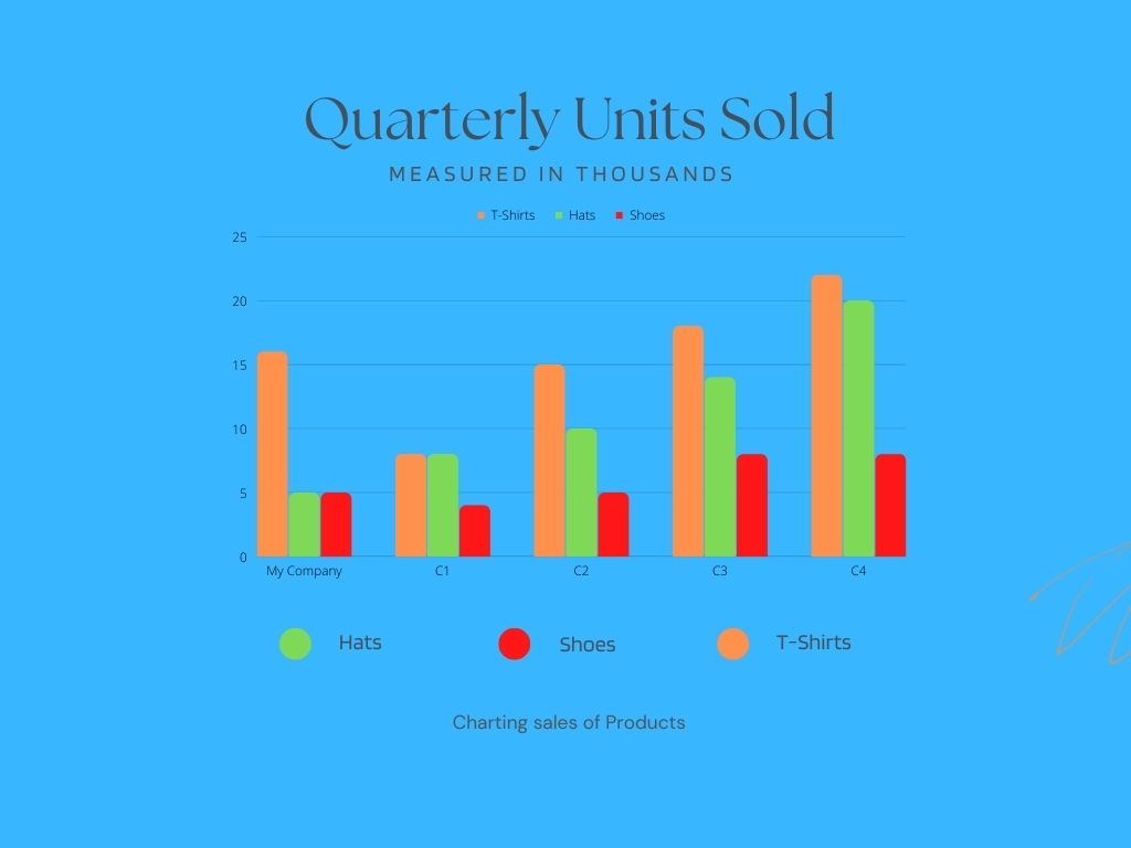
Of course, if you add more variables to your spreadsheet, you’ll also have more options for bar graphs, pie charts, and more.
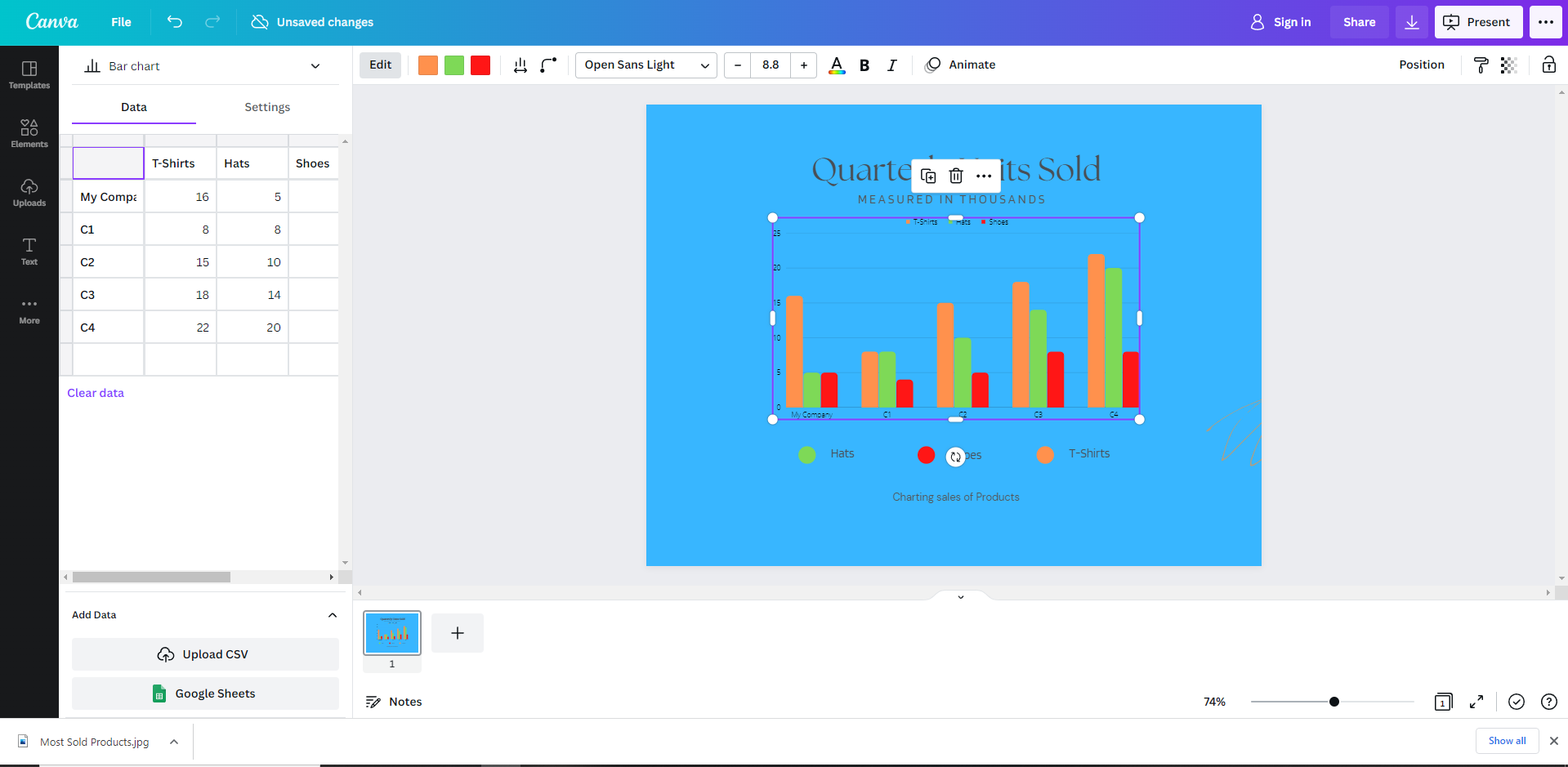
Create a simple comparison chart with Canva
For something a little more presentable, Canva offers great templates for free, and Pro accounts for creating simple comparison charts using its visual editor.
For example, Free version of Canva It contains dozens of layouts that allow you to modify the layout’s aesthetic and internal values.
 Screenshot from Canva, November 2022
After customizing the template, the final result looked like this:
 Screenshot from Canva, November 2022
Visualize your competition with Vizzlo’s bubble map
Data visualization tools such as Vislo Offer sophisticated ways to brand and customize your competitor map to your liking.
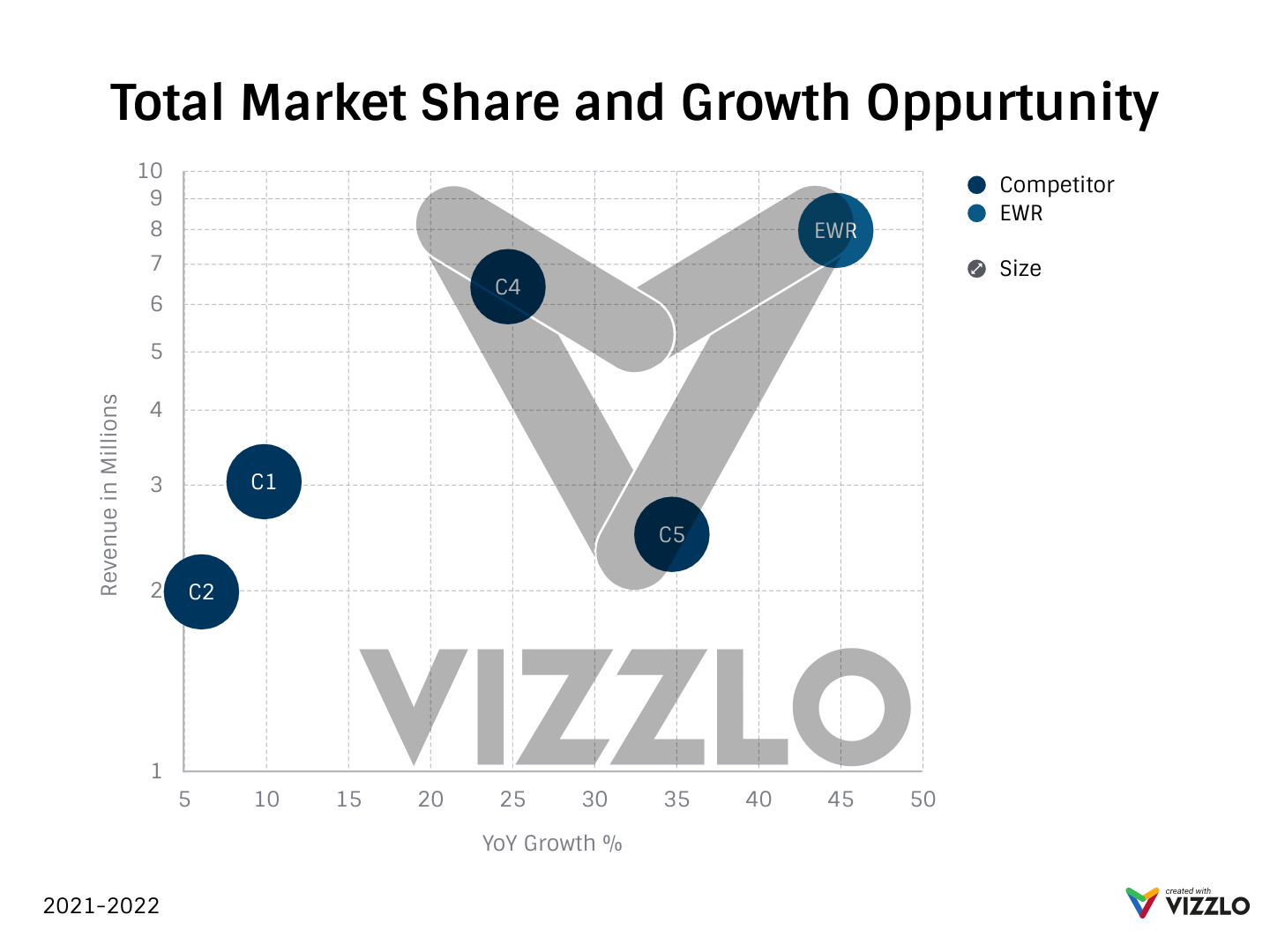 Shot by Vizzlo, November 2022
I highly recommend adding your own custom values and entering them into your bubbles to get an accurate representation.
You can also click anywhere in the graph to create a bubble based on where a custom value meets its equilibrium on the graph.
In general, working with a design tool, Excel sheet, or data visualization is very easy and provides opportunities for branding, customization, and simplification of your research.
Create an automated chart with Python
Google Data Studio is an excellent data visualization tool, but manually entering or sharing data from spreadsheets can be tedious.
However, this guide offers a great way to integrate results from a Python script directly into Data Studio.
To get a quick idea, the script is designed to analyze how many keywords your competitors’ top page occupies in a single URL.
By integrating CSV data from Python into a custom Data Studio template, an author can discover which pages are top-ranking for several keywords and analyze the trends they were following to get to those rankings.
Alternatively, if you’re using Enterprise SEO Tools, they already have competitive mapping schemes built in, and you don’t have to create them manually.
5. Highlight areas for improvement
Finally, the final step in competitor mapping is to identify your areas of improvement.
In each chart, you must be able to uncover the relationship between the data that helps you determine strategies to create a unique selling proposition or exploit a competitor’s weakness.
Consider running multiple forms of competitor analysis to help uncover a better understanding of your data and identify trends and relationships.
Overall, competitor mapping is a relatively simple process, and plenty of tools allow you to create or automate your competitors map.
More resources:
- Competitor backlink analysis using Python [Complete Script]
- SEO Competitive Analysis: The Definitive Guide
- How to Do SEO Keyword Research: The Ultimate Guide
Featured image: / shutterstock